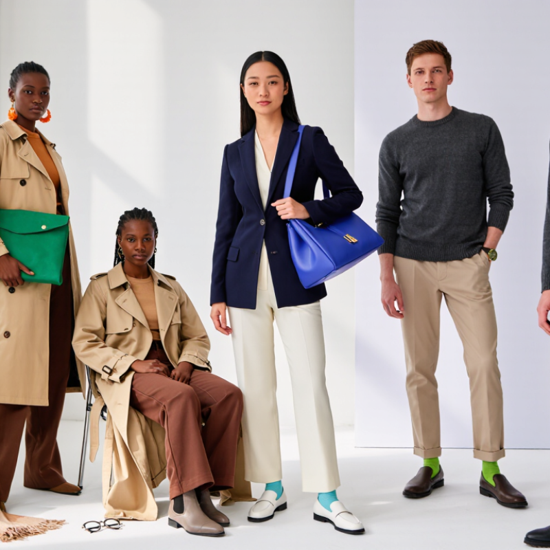
How To Match Colors In Fashion Outfits is not about obeying a rigid color wheel. It is about creating balance between clothing, skin tone, texture, and occasion. A navy blazer beside warm ivory trousers feels calm, while a cobalt bag can add a sharp point of energy. Small choices matter. Even sock color can change the outfit’s visual rhythm.
Industry research supports this practical approach. The Business of Fashion and McKinsey’s State of Fashion reports consistently describe consumers as more value-conscious and selective, making versatile styling increasingly important. Reports from Pantone Color Institute and WGSN also show how seasonal color forecasts influence retail collections, accessories, and consumer buying decisions. These forecasts are useful, but they are not personal rules. A runway shade may look brilliant under studio lighting and strangely flat beside your everyday coat.
Leatrice Eiseman, executive director of the Pantone Color Institute, has said that “color is the most important visual element in fashion.” Her observation explains why matching deserves careful attention. The seven methods in this guide explore complementary shades, tonal dressing, neutral foundations, contrast control, and accent placement. They also recognize real wardrobe problems: faded black fabric, indoor lighting, and colors that behave differently on different materials. No formula works perfectly every time. That is the point. Good color matching involves testing an outfit in daylight, noticing what feels uncomfortable, and adjusting without abandoning personal style.
Color matching becomes easier when you treat clothing like a visual map. The color wheel shows primary, secondary, and tertiary colors. Complementary colors sit opposite each other, such as blue and orange. They create strong contrast. Analogous colors sit beside each other, such as green, blue, and violet. They usually feel calmer. According to a 2024 YouGov international color-preference survey, blue ranked among the most widely preferred colors across surveyed markets. That finding supports a practical idea: blue can act as a reliable base, but personal coloring and context still matter.
Try one dominant color, one supporting color, and a small accent. A navy shirt, cream trousers, and rust socks can look balanced without feeling flat. For a softer outfit, use three neighboring shades, such as sage, olive, and muted yellow. The Coloro and WGSN 2024 color forecast also highlights increasing interest in expressive, nature-linked tones. Forecasts are useful, though they are not strict rules. Fashion remains personal.
Tips: Start with a neutral base. Add one complementary accent. Check the outfit in daylight. Texture changes color perception, too. A matte brown jacket may appear quieter than glossy brown shoes. I sometimes overmatch accessories, and the result feels forced. Leave one element imperfect. That small break can make the outfit look more natural.
Monochromatic outfits use one color family from head to toe. Tonal outfits use nearby shades, such as cream, camel, and warm brown. Both methods create visual order without making an outfit look flat. The 2024 Global Resale Report projects the secondhand apparel market will reach $350 billion by 2028. That growth supports buying versatile pieces that work across several outfits.
Start with one anchor piece. Try charcoal trousers, a soft-gray knit, and a slate overshirt. Keep the textures different. A smooth shirt beside brushed wool adds depth. For a lighter look, combine ivory denim, oatmeal cotton, and sand-colored suede. The colors should sit close, but they should not match perfectly. Perfect matching can appear overly staged.
Use contrast carefully. A tonal outfit usually benefits from one darker or lighter layer near the face. A deep olive jacket can sharpen moss trousers and a pale green shirt. According to the 2024 State of Fashion report, value-conscious shoppers are placing greater importance on versatility and cost per wear. That makes tonal dressing practical, not merely aesthetic. My own mistake is relying too heavily on beige. It can look refined in daylight, then dull indoors. Check the outfit under natural and artificial light. A muted accessory, textured belt, or silver-toned detail may restore definition without breaking the color story.
| № | Color-Matching Method | Core Principle | Example Palette | Suggested Outfit Formula | Best Styling Result | Practical Tip |
|---|---|---|---|---|---|---|
| 1 | Monochromatic | Use different lightness and saturation levels of one hue. The shared hue creates visual unity while tonal variation prevents the outfit from looking flat. |
Deep navy, medium blue, pale blue
#0B1F3A · #356A9A · #B9D7EA
|
Dark blue trousers + mid-blue shirt + pale blue overshirt | PolishedElongatingLow effort | Change fabric texture or silhouette between pieces so the similar colors remain visually distinct. |
| 2 | Tonal Neutrals | Combine nearby neutral shades such as ivory, beige, camel, taupe, gray, or charcoal. |
Ivory, warm beige, camel, chocolate
#F7F1E3 · #D8C3A5 · #B58B5A · #5A3825
|
Ivory knit + camel trousers + chocolate shoes or belt | SophisticatedTimelessSoft contrast | Keep undertones consistent: warm neutrals pair naturally with warm neutrals, while cool grays work best with cool neutrals. |
| 3 | Analogous Colors | Pair neighboring hues on the color wheel. The colors share visual characteristics and usually create a harmonious combination. |
Green, teal, blue
#2E7D5B · #168AAD · #2F5D8C
|
Teal blouse + navy skirt + green-gray jacket | CoordinatedCreativeBalanced | Choose one dominant color, one supporting color, and use the third color only in a smaller area. |
| 4 | Complementary Accent | Use colors opposite each other on the color wheel, but let one color dominate and reserve the opposite hue for an accent. |
Navy and warm orange
#1B365D · #D97736 · #F4E6D1
|
Navy suit or jacket + neutral shirt + rust-orange scarf or bag | High impactModernFocused | Keep the accent color to approximately one small outfit area, such as shoes, a bag, a tie, or jewelry. |
| 5 | Three-Color Rule | Build the outfit around one dominant color, one secondary color, and one small accent. This creates structure without requiring exact matching. |
Black, white, red
#171717 · #FFFFFF · #B3261E
|
Black trousers + white top + red shoes or compact shoulder bag | ClearVersatileEasy to repeat | Count visible colors rather than individual garments; different shades of the same hue can read as one color family. |
| 6 | Neutral Foundation + Color Accent | Start with one or two neutrals and introduce a single noticeable hue to make the outfit more expressive. |
Gray, white, cobalt blue
#6B7280 · #FFFFFF · #2563EB
|
Gray trousers + white T-shirt + cobalt jacket or blue footwear | ApproachableFlexibleContemporary | Repeat the accent color once in a smaller detail if you want the outfit to feel intentionally connected. |
| 7 | Contrast Through Lightness | Match colors by controlling how light or dark they appear. Strong lightness contrast helps separate garments even when their hues are similar. |
Soft lavender, plum, charcoal
#D8C7E8 · #6E3B75 · #30343B
|
Light lavender top + plum layer + charcoal trousers | DefinedFigure-shapingDramatic | Place lighter colors where you want attention and darker colors where you want a quieter visual base. |
Matching colors becomes easier when you understand two reliable relationships: complementary and analogous colors. Complementary pairs sit opposite each other on the color wheel, such as navy and warm orange. They create energy, but equal intensity can look noisy. I often use one color as the main layer and the opposite shade in smaller details. Try a navy jacket, a muted orange scarf, and cream trousers. The contrast feels intentional without shouting.
Analogous colors sit beside each other, such as green, teal, and blue. They create a calmer outfit and work well for office settings or relaxed weekends. Keep one shade dominant, then adjust lightness and texture. A teal knit top with olive trousers and pale blue sneakers may sound unusual, yet the shared cool feeling connects them. Texture matters. Smooth cotton, brushed wool, and matte leather can prevent nearby colors from blending into one flat block.
Balance does not mean perfect symmetry. A practical rule is to let one color cover about 60 percent, a supporting color 30 percent, and an accent 10 percent. These numbers are a guide, not a law. In a fitting room, photograph the outfit under natural light, because indoor bulbs can distort orange and green. I once paired bright violet with strong yellow and underestimated the effect; the colors competed all day. Lowering the yellow to a soft butter tone helped, though the result still felt bolder than expected. That small discomfort is useful feedback.
Neutrals are the quiet structure behind a convincing outfit. Black, white, gray, beige, navy, and brown reduce visual noise. They also create space for one key color to speak clearly. In my styling experience, a neutral base makes contrast easier to control, especially when fabric textures already attract attention. A red scarf on a gray coat feels intentional. The same scarf beside several bright colors may look accidental.
Color research supports this restraint. YouGov’s international color surveys frequently place blue among the most preferred colors, with roughly one-third of respondents choosing it in several markets. Blue can work like a soft neutral when paired with denim, cream, gray, or brown. The State of Fashion reports from McKinsey and The Business of Fashion also emphasize stronger value awareness, making versatile pieces increasingly practical. A neutral wardrobe supports more combinations and may reduce unnecessary purchases.
Try a 70-20-10 balance: 70 percent neutral, 20 percent supporting color, and 10 percent accent. A beige suit, pale blue shirt, and orange shoes show the idea clearly. Keep the brightest color near the area you want noticed. This might be the face, waist, or shoes. Small details matter. A black belt can separate two similar shades and sharpen the silhouette. Still, I sometimes rely too heavily on beige. It can flatten an outfit. Texture, light, and personal coloring deserve more attention than any formula.
7 Best Ways To Match Colors In Fashion Outfits?
Match Colors to Skin Tone, Occasion, and Personal Style
Start with your skin tone, but do not treat it as a strict rule. Warm undertones often suit rust, olive, cream, and golden brown. Cool undertones can work well with berry, navy, charcoal, and icy blue. Neutral undertones have more freedom. I test colors near my face in daylight, because indoor bulbs can change everything. A plain white shirt helps reveal whether a shade makes the skin look bright or tired.
Use one dominant color, one supporting color, and a small accent. A navy outfit with a pale blue shirt feels polished for work. Add a muted red scarf for controlled contrast. For casual plans, try denim, soft green, and warm beige. Formal occasions usually need lower contrast and fewer competing shades. Weekend outfits can handle brighter combinations. Keep accessories within the same visual mood. It prevents the outfit from looking accidental.
Personal style matters more than color charts. I once avoided orange for years, then found that a darker terracotta felt natural with my wardrobe. That changed my approach. Test color beside your favorite jacket, shoes, or bag. Notice how you feel walking, sitting, and moving. Comfort affects confidence. Some combinations look perfect in a mirror but feel strangely loud outside. Adjust the brightness, not only the color. Fashion advice can guide you, but your own reflection remains useful evidence.
Match colors to skin tone, occasion, and personal style
The chart compares the approximate lightness contrast between each outfit’s main color and a coordinating color. Higher contrast can improve visual separation, while lower contrast creates a softer, more monochromatic look. Use warm, cool, or neutral shades according to your skin’s undertone, then adjust the intensity for the occasion and your personal style.
It uses one color family from head to toe. Different textures keep it from looking flat. A smooth shirt with brushed wool adds depth.
Tonal dressing combines nearby shades, such as cream, camel, and warm brown. The colors should relate, not match perfectly. Perfect matching can look staged.
Start with charcoal trousers. Add a soft-gray knit and a slate overshirt. Keep the fabric surfaces different. This creates quiet visual structure.
Let one color dominate and use its opposite in a small detail. Try navy with muted orange and cream. Equal intensity may look noisy.
Choose neighboring shades, such as teal, olive, and pale blue. Make one shade dominant. Texture helps separate the colors.
Use one color for about 60 percent, another for 30 percent, and an accent for 10 percent. It is guidance, not law. Some outfits still feel wrong.
Warm undertones often suit rust, olive, cream, and golden brown. Cool undertones may suit berry, navy, charcoal, and icy blue. Test colors near your face in daylight.
Formal settings usually suit lower contrast and fewer competing shades. Weekends can handle brighter combinations. Your comfort matters more than a color chart. I still get this wrong sometimes.
Indoor bulbs can distort orange and green. Photograph the outfit in natural light when possible. Smooth cotton, brushed wool, and matte leather add separation. Small details matter.
Learning How To Match Colors In Fashion Outfits begins with understanding the color wheel and the relationships between primary, secondary, and tertiary shades. A simple way to create a polished look is to use a monochromatic or tonal palette, combining different depths of the same color. For more contrast, complementary colors can make an outfit eye-catching, while analogous colors create a softer, harmonious effect. The key is to balance strong shades with quieter tones so the overall look remains coordinated rather than overwhelming.
Neutral colors such as black, white, beige, gray, and navy can control contrast and help highlight a statement piece. Color choices should also suit your skin tone, the occasion, and your personal style. Bright combinations may work well for social settings, while restrained palettes can feel more appropriate for professional or formal situations. With thoughtful balance and confidence, color matching becomes a practical way to express individuality.